Mello
An app for small plans
everything it took:
 React Native
 Supabase
 Visual Studio Code
 After Effects
 LottieFiles
 Claude
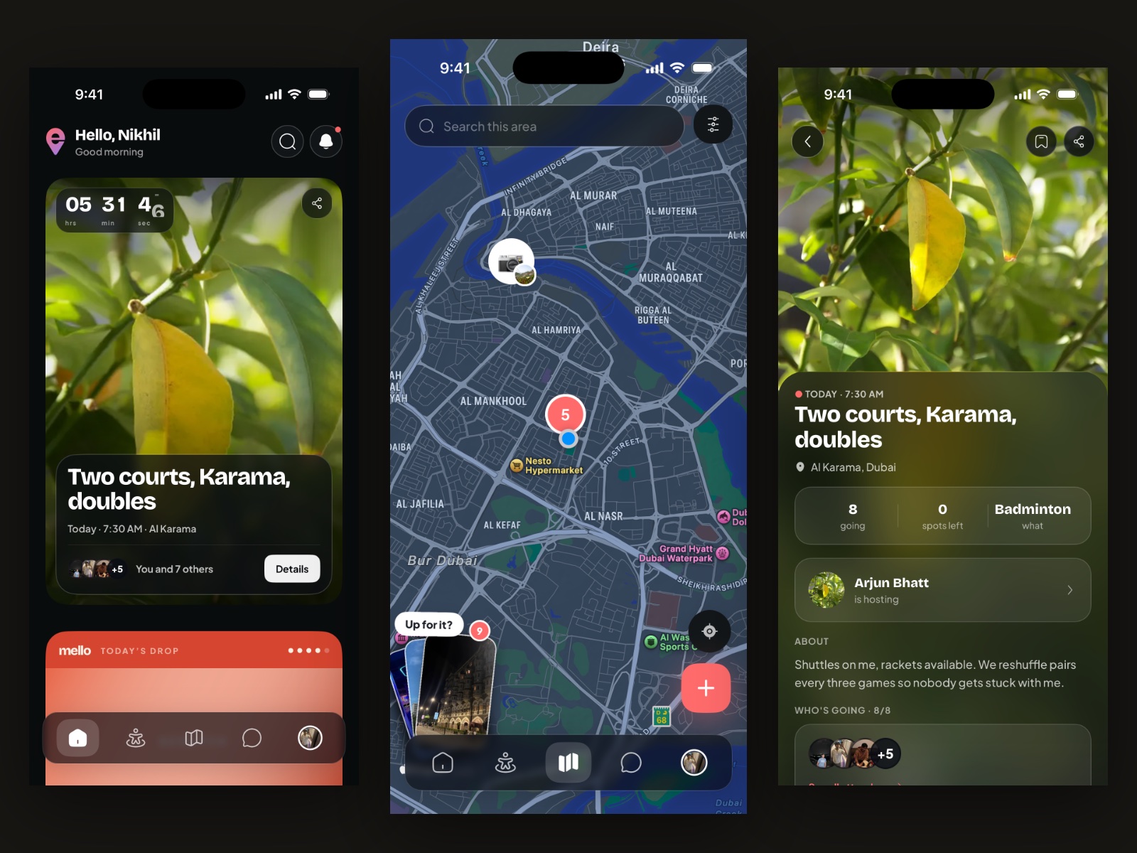
No brief, because there was no client. Mello started from something I kept running into myself: making plans is hard, and you do not always have people around to make the plans you would actually enjoy. The diagnosis I settled on was choice, not that people are unwilling, but that there is never enough on offer to pick from. Most apps make you choose between seeing the people you already know and meeting new ones. This one refuses to pick a side.
A deck of cards
The app is card-based, and that is an argument rather than a style: a deck says there is always something in it, and nobody holds just one card. Plans are plural, so choosing one should feel like choosing a card. The map puts what is near you on the table whatever it is, a countdown and a capacity give it urgency, and Today’s Drop is the reason to open the app again tomorrow. The name had to be easy enough to say to become a habit, and the pin is the mark on the e, because dropping a pin is how you make a plan anywhere.
Too much, too early
A couple of hundred testers on TestFlight, and the first thing they reported was being overwhelmed on opening it. Three changes, all aimed at the same cause: some functions are locked on a first run so there is less to take in at once, nudges confirm you are going the right way rather than leaving you to guess, and home carries a checklist and a to-do so progress through the app is visible instead of assumed. More testers got through setup afterwards. That is something I watched happen rather than something I measured, so there is no figure on it.
A card you flip, not a modal
Opening an event used to raise a modal from the bottom of the screen, which made finding out about a five-a-side game look like filling in a form. It is a dealt card that flips over now. The deck was already the thesis; the pin was the last place still behaving like a generic app, and the gesture that replaced it says the same thing the brand does.
Multiplied, not added
How many posts surface, and from how far away, runs on a weighting system I planned out of Meta’s published papers and then built with Claude. The weights multiply rather than add, which is the whole point: addition lets one loud signal carry a weak post on its own, where multiplication makes a post earn every axis at once: how close it is, whether anyone you know has touched it. It also declines to show you the same posts twice, in a way meant to read as chance, because the perception of random matters more than actual randomness.
Production. The design and the brand are finished and handed on, which is where my part of it ends. Nothing here has met an audience outside TestFlight yet, so there is no launch to report and I would rather not write one early.